How to Take Great Food Photos With Just Your Phone
Professional food photography costs $50–100 per dish. For a restaurant with 30 menu items, that’s $1,500–3,000 for a full set of photos. For many independent restaurants, that’s not in the budget, at least not right away.
Here’s the thing though: modern smartphones take really good food photos. Not “good enough for Instagram” good. Actually good: sharp, well-lit, appetizing. The kind of photos that make people tap on a menu item instead of scrolling past it.
The difference between a bad phone photo and a great one isn’t the camera. It’s lighting, composition, and a handful of techniques that anyone can learn in an afternoon. This guide covers all of them.
Why Food Photos Matter for Menus
Before getting into technique, it’s worth understanding why this matters:
- Menu items with photos get ordered up to 30% more than items without photos, according to multiple restaurant industry studies.
- Digital menus with photos see higher engagement. Customers spend more time browsing, explore more sections, and are more likely to add extras.
- Photos reduce uncertainty. When a customer can see exactly what “house-smoked brisket with charred corn salsa” looks like, they’re more confident ordering it. Fewer disappointed customers, fewer returned plates.
- Visual content drives social sharing. Customers who photograph their food and share it are giving you free marketing. Better-looking dishes get shared more.
For restaurants using digital menus, photos directly affect what people order and how much they spend.
Lighting: The Single Most Important Factor
If you take one thing from this guide, make it this: good lighting changes everything. A poorly lit photo of a beautiful dish will look terrible. A well-lit photo of a simple dish will look appetizing.
Natural Light Is Your Best Friend
The best light source for food photography is a window. Natural, indirect light creates soft shadows and true colors that make food look the way it actually looks in person.
What works:
- A table near a large window, ideally on an overcast day or during golden hour (the hour before sunset)
- Light coming from the side or slightly behind the food
- Diffused light. If direct sunlight is hitting the table, hang a white sheet or place a sheer curtain over the window
What doesn’t work:
- Overhead fluorescent lights (the standard in most restaurant kitchens), which cast greenish, unflattering light
- Direct flash, which flattens everything and creates harsh shadows
- Mixed lighting (natural + artificial), which creates weird color casts that are hard to fix in editing
Side Lighting vs. Backlighting
Side lighting (light hitting the food from the left or right) is the safest bet for beginners. It creates gentle shadows that give the food dimension and texture. A bowl of soup looks flat under overhead light but gains depth and warmth with sidelight.
Backlighting (light coming from behind the food, toward the camera) is more advanced but creates beautiful results. It makes drinks glow, gives salads a translucent quality, and creates a rim of light around the edges of the plate. The catch: you need to expose for the food, not the background, which may mean the background blows out to white. That’s usually fine.
The Bounce Card Trick
When light comes from one direction, the opposite side of the food falls into shadow. A simple fix: hold a piece of white cardboard or a white napkin on the shadow side. This bounces light back and fills in the dark areas. It’s the cheapest piece of photography equipment possible, and it makes a noticeable difference.
Composition: Arranging the Shot
The Three Angles That Work
You don’t need to experiment with dozens of camera angles. Three angles cover virtually every type of dish:
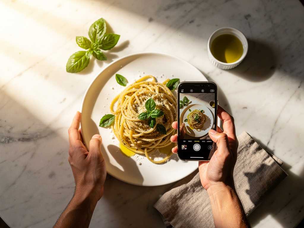
Overhead (flat lay), 90 degrees above the food Best for: Pizza, grain bowls, charcuterie boards, anything flat or arranged in a pattern. This angle shows the full layout and works great for dishes where the top is the most visually interesting part.
45-degree angle, the natural dining perspective Best for: Burgers, sandwiches, plated entrees, anything with height. This is roughly how a diner sees the food, so it feels natural and appetizing. It’s the most versatile angle and a safe default.
Straight on, eye level with the food Best for: Layered dishes (parfaits, layer cakes), stacked burgers, tall cocktails. This angle emphasizes height and layers. It also works well for drinks.
The Rule of Thirds
Most phones have a grid overlay option in the camera settings. Turn it on. The grid divides the frame into nine equal sections. Place the main subject along one of the grid lines or at an intersection point, not dead center. This creates a more dynamic, professional-looking composition.
For a single plate: Place it at one of the lower intersections, leaving space above and to one side for context (a napkin, cutlery, a drink in the background).
For multiple items: Arrange them along a diagonal line through the frame. Our eyes naturally follow diagonal lines, so this creates visual flow.
Negative Space and Decluttering
The most common composition mistake in food photography is cramming too much into the frame. Leave breathing room around the food. A clean background, even just a plain table surface, directs all attention to the dish.
Remove anything from the frame that doesn’t add to the story: random condiment bottles, stacked plates, crumpled napkins, water glasses with lipstick marks. If it’s in the frame, it should be there on purpose.
Props and Styling
A few simple props add context and warmth:
- Fresh ingredients used in the dish (herbs, citrus, spices) scattered near the plate
- Clean cutlery placed casually beside the plate
- A linen napkin for texture
- A hand reaching for the food, which adds life and makes the photo feel candid rather than staged
Don’t overdo it. Two or three supporting elements are enough. The food should always be the star.
Phone Camera Settings and Techniques
Use the Main Camera Lens
Most phones have multiple lenses. For food, use the main (1x) lens. It has the largest sensor, captures the most light, and produces the sharpest images. Avoid the ultra-wide lens (it distorts the edges) and use the telephoto lens sparingly (it’s useful for tight detail shots but captures less light).
Lock Focus and Exposure
Tap the screen on the food to lock focus. On most phones, you can then slide up or down to adjust exposure (brightness). For food photography, it’s better to slightly underexpose and brighten in editing than to overexpose and lose detail in the highlights.
Avoid Digital Zoom
If you need to get closer, move your feet. Digital zoom degrades image quality noticeably. Get physically closer to the food or crop in editing afterward. Both produce better results than zooming.
Portrait Mode: Use with Caution
Portrait mode creates a blurred background (bokeh) that can look professional. But phone portrait mode uses software to guess what should be sharp and what should be blurred, and it doesn’t always get it right. Edges of the plate may blur unnaturally, or sauce drips may disappear into the background.
Test it on a few dishes before committing. For some shots it works beautifully. For others, especially dishes with complex edges or steam, it creates distracting artifacts.
Shoot More Than You Think You Need
Take 10–15 photos of each dish from slightly different angles and distances. It takes seconds, and you’ll be glad to have options when you’re editing later. The difference between a good food photo and a great one is often a tiny shift in angle or a slightly different arrangement of the plate.
Editing: Simple Adjustments That Make a Big Difference
Editing doesn’t mean applying heavy filters. It means making small corrections that bring the photo closer to how the food actually looked.
Recommended Apps
- Snapseed (free, iOS and Android). Professional-level controls in a simple interface. The best free option.
- VSCO (free with paid options). Great preset filters that look natural, not overdone.
- Lightroom Mobile (free with paid options). Full professional editing tools, syncs with desktop.
- The built-in Photos app. Both iOS and Android have capable built-in editors for basic adjustments.
The Five Adjustments That Matter
In order of impact:
-
White balance/temperature. Make sure whites look white and the overall tone is warm (but not orange). Food under artificial light often looks too cool (blueish) or too warm (yellowish). Correct this first.
-
Exposure/brightness. Slightly brighter than real life usually works best for food. But don’t overdo it. You want to keep the shadows that give the food depth.
-
Contrast. A small bump in contrast makes colors pop and gives the image more punch. Too much contrast makes it look harsh and artificial.
-
Saturation. A very gentle increase in saturation makes food colors more vivid. Emphasis on gentle. Oversaturated food photos are one of the most common amateur mistakes. The food should look appetizing, not radioactive.
-
Sharpness. A slight sharpness increase makes details (grill marks, herb leaves, sauce textures) pop. Again, less is more here.
What Not to Do in Editing
- Don’t use heavy Instagram-style filters. They make food look dated and artificial.
- Don’t oversaturate. If the tomato sauce is glowing neon red, dial it back.
- Don’t over-smooth or over-sharpen. Both look unnatural.
- Don’t crop too tight. Leave some context around the food.
A good edit should be invisible. If someone looks at the photo and thinks “that’s been edited,” it’s been edited too much.
Common Mistakes to Avoid
Shooting Under Kitchen Lights
The restaurant kitchen is the worst possible place to photograph food. Fluorescent overhead lights, stainless steel surfaces reflecting everywhere, cluttered backgrounds. If possible, bring the plated dish to a table near a window for the photo. The 30 seconds it takes to move the plate will transform the result.
Ignoring the Plate and Table
A beautiful dish on a dirty plate or a cluttered table instantly looks unappetizing. Wipe the rim of the plate. Clear the background. Use a clean surface. This stuff matters more than your camera technique.
Waiting Too Long to Shoot
Food has a narrow window where it looks its best. Ice cream melts, steam dissipates, greens wilt, sauces congeal. Plate the dish, arrange the shot quickly, and shoot within 1–2 minutes. Have the camera open and the setting ready before the food arrives.
Shooting Everything from the Same Angle
Different dishes look best from different angles. A flat lay that works perfectly for a pizza will make a burger look like a disc. Match the angle to the dish’s strongest visual feature: height, layers, surface texture, or arrangement.
Building a Photo Library for Your Menu
Plan a Photo Session
Don’t try to photograph every menu item during regular service. Set aside 1–2 hours during a quiet period (between lunch and dinner works well for most restaurants):
- Prep the space. Find a table with the best natural light. Clear it. Set up a simple background.
- Prep the plates. Have the kitchen prepare 8–10 key dishes, starting with cold items (they last longer) and ending with hot items.
- Shoot each dish from 2–3 angles. Take 10–15 shots per dish.
- Review and edit the best shots that evening while the food is still fresh in your memory.
Prioritize Your Most Important Items
You don’t need to photograph everything on day one. Start with:
- Your highest-margin items (the ones you want to sell more of)
- Your most visually appealing dishes
- Category headers (one hero shot per menu section)
- Bestsellers that customers already love
A digital menu with photos on your top 10–15 items is far more effective than a menu with mediocre photos on every item.
Consistency Matters
Use the same lighting setup, the same background, and the same editing style across all your food photos. A menu where every photo looks like it was taken in the same restaurant (because it was) feels cohesive and professional. A menu where photos have different lighting, different color temperatures, and different styles feels disorganized.
When to Hire a Professional
Phone photography can take you very far, but there are situations where professional photography is worth the investment:
- Grand opening or rebrand, where first impressions matter, and a full set of professional photos establishes the visual standard.
- High-end restaurants where the food presentation is part of the value proposition.
- Marketing campaigns (ads, billboards, print materials) where resolution and production value need to be higher.
- Menu items that are genuinely difficult to photograph, like dark-colored dishes, highly reflective sauces, or dishes with steam.
A good approach: shoot your everyday menu items with your phone, and hire a professional once or twice a year for hero shots and seasonal updates. This keeps costs manageable while maintaining quality.
Putting Photos to Work
Great food photos are only valuable if customers see them. Once you’ve built a library:
- Add them to your digital menu. Platforms like MenuStack make it easy to attach photos to individual menu items.
- Update your Google Business Profile with fresh food photography. Photos on Google listings drive clicks and visits.
- Use them on social media. A library of quality food photos gives you weeks of social content.
- Add them to your website: the menu page, the homepage gallery, blog posts.
The photos you take today will work for you across every channel for months. A couple hours of shooting goes a long way.