QR Code Menu Templates: 8 Beautiful Designs for Every Restaurant Style
A QR code menu template does two jobs at once: it makes your menu look professional, and it makes the building process fast. But not all templates are created equal, and picking the wrong one can work against you. A minimalist fine dining template on a fun taco shop feels off, and a bright, playful design on a steakhouse menu undermines the experience before a customer even orders.
This guide breaks down 8 distinct menu template styles, what kind of restaurant each one suits, and what design elements make each effective. The goal is to help you match your template to your brand so your digital menu feels like a natural extension of your restaurant, not a generic tech add-on.
What makes a good QR code menu template
A few things separate good templates from mediocre ones, regardless of style:
Mobile-first layout
Over 95% of QR menu scans happen on phones. A template designed for desktop that “also works on mobile” is backwards. The best templates are built mobile-first: single-column layouts, large touch targets, and text that’s readable without pinching or zooming.
Fast load times
Heavy templates with large background images, complex animations, or excessive JavaScript defeat the purpose. Customers are scanning your QR code because they want to see the menu quickly. If it takes more than 2-3 seconds to load, a lot of people will give up.
Clear hierarchy
A good template guides the eye with typography, spacing, and layout, not gimmicks. The customer’s eye should move naturally: category name, item name, price, description. In that order.
Brand flexibility
The best templates work as a foundation that adapts to your brand, not a rigid design that makes every restaurant look the same. A range of curated color schemes, logo options, and style accessories let you match a template to your brand without needing to make dozens of micro design decisions.
Accessibility
Sufficient contrast ratios, legible font sizes, and logical tab order aren’t nice-to-haves. They’re requirements. A template that looks beautiful but is unreadable for people with vision impairments fails at its core purpose.
The 8 template styles
1. Clean Minimal, Best for Cafes and Coffee Shops
Design philosophy: Less is more. White space does the heavy lifting, and the menu itself is the star, with no visual noise competing for attention.
Key design elements:
- Light background (white or very light warm gray)
- Simple sans-serif typography
- Generous spacing between items
- Minimal use of color, usually one accent color for prices or category headers
- No background images or textures
Why it works for cafes: Cafe menus are typically compact (15-30 items across a few categories). A minimal template lets that small menu breathe instead of trying to fill space with decorative elements. It also reflects the aesthetic most modern cafes already project in their physical space: clean, curated, intentional.
Best for: Coffee shops, juice bars, bakeries, brunch spots, and any venue with a smaller, focused menu.
Watch out for: Minimal templates can feel empty if you have a large menu. If your cafe also serves a full lunch and dinner menu, consider whether a more structured template would serve you better.
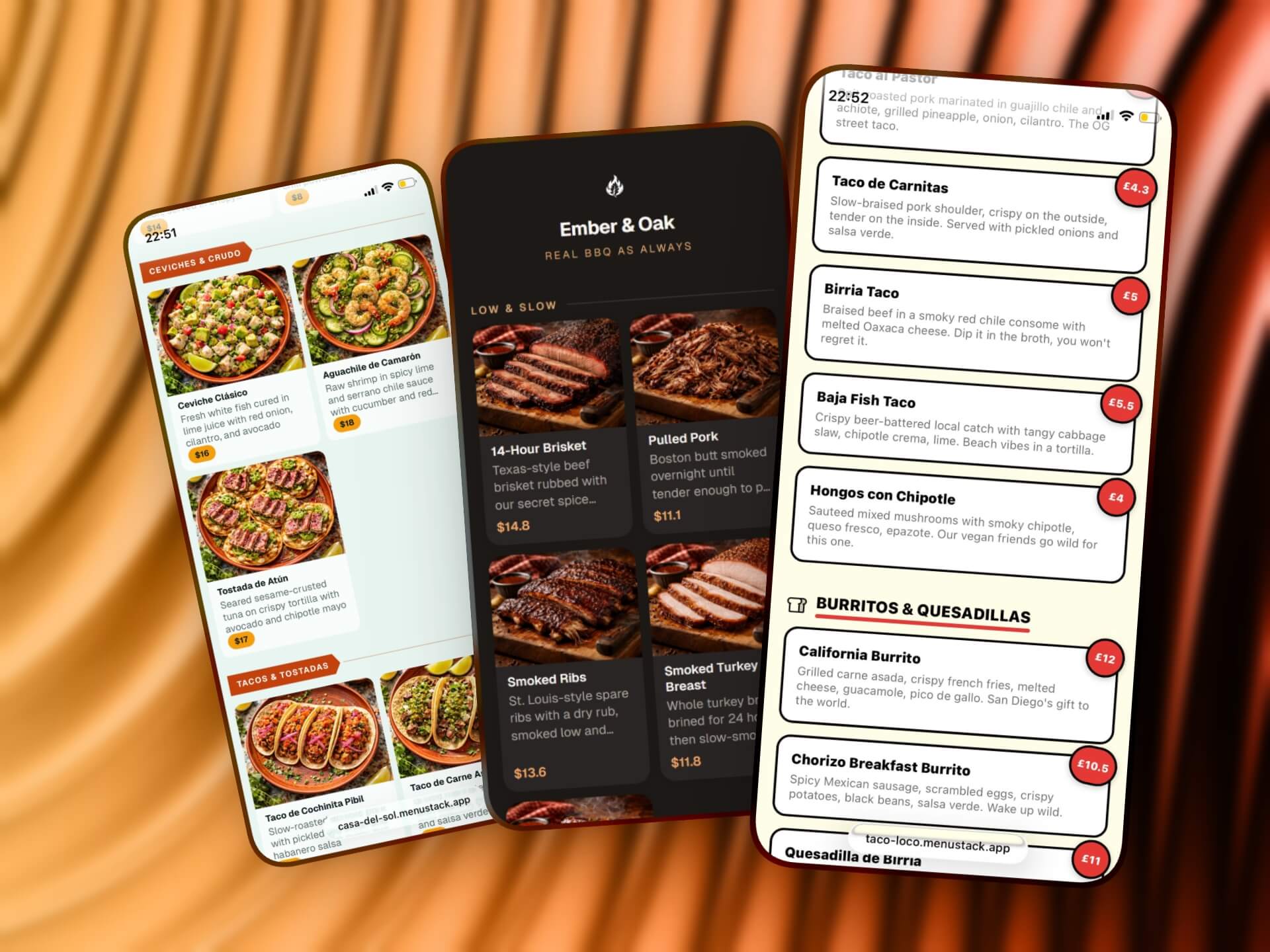
2. Photo-Forward, Best for Casual Dining
Design philosophy: Show, don’t tell. Large, high-quality food photos are the primary selling tool, with text playing a supporting role.
Key design elements:
- Prominent image slots for each item or featured items
- Card-based layout where each item is a self-contained visual unit
- Shorter descriptions (the photo does most of the communicating)
- Slightly larger overall footprint (more scrolling, but more impact)
Why it works for casual dining: Casual restaurants live and die by visual appeal. When someone is deciding between the burger and the pasta, a photo tips the decision far more effectively than a text description. Casual dining also tends to have a broader menu, and photos help customers navigate faster than reading every description.
Best for: Family restaurants, casual dining chains, pizza places, and any restaurant where food presentation is a selling point.
Watch out for: This template style only works if you have good photos. A photo-forward template with low-quality, poorly lit phone snapshots will hurt more than it helps. If you don’t have professional food photography, consider using this template for featured items only, or choose a different style until you can invest in proper photos.
3. Elegant Typography, Best for Fine Dining
Design philosophy: Sophistication through restraint. Typography is the design. No photos, no flashy elements, just beautiful type and careful spacing.
Key design elements:
- Serif or elegant sans-serif fonts
- Dark text on cream or off-white backgrounds (or light text on dark backgrounds)
- Generous margins and line spacing
- Price formatting that avoids dollar signs (e.g., “32” instead of “$32.00”)
- Subtle dividers or ornamental elements between sections
Why it works for fine dining: Fine dining restaurants sell an experience, and that experience starts with presentation. A typographic menu conveys the same care and attention to detail that goes into the food and service. Photos can actually undermine fine dining menus. They remove the element of anticipation and can feel commercial.
Best for: Fine dining, upscale steakhouses, tasting menu concepts, wine bars with curated food menus.
Watch out for: This style requires strong copy. Without photos to lean on, your item descriptions need to be compelling. “Grilled salmon with vegetables” won’t cut it. “Wild king salmon, charred broccolini, preserved lemon, brown butter” tells a story.
4. Bold and Colorful, Best for Fast Casual
Design philosophy: Energy and personality. Bright colors, strong typography, and a layout that moves fast, matching the pace of the venue.
Key design elements:
- Bright color palette (brand-specific)
- Bold, chunky typography, often a mix of weights and sizes
- Tight spacing that keeps everything compact
- Optional: illustrations or icons instead of (or alongside) photos
- Clear price callouts, often in colored badges or buttons
Why it works for fast casual: Fast casual restaurants (think poke bowls, build-your-own burrito places, acai shops) thrive on energy and customization. The menu needs to communicate quickly because the ordering process is fast. Bold templates match the brand energy these places already have and guide people through the options quickly.
Best for: Build-your-own concepts, smoothie/bowl shops, fast casual chains, food halls, and restaurants targeting a younger demographic.
Watch out for: Bold doesn’t mean chaotic. If every element is competing for attention, nothing stands out. Pick one or two accent colors and use them consistently. Keep the layout structured even if the visual style is energetic.
5. Dark Mode, Best for Bars and Nightlife
Design philosophy: Atmosphere first. The menu should feel like part of the venue’s ambiance, not a bright disruption.
Key design elements:
- Dark background (deep charcoal, navy, or true black)
- Light text in warm tones (off-white, cream, or gold)
- Subtle accent colors (amber, deep red, or copper work well)
- Simplified navigation for quick browsing
- Larger font sizes to compensate for ambient dim lighting
Why it works for bars: When someone opens a bright white menu in a dark bar, it’s like turning on a flashlight. It disrupts the mood for everyone nearby. Dark mode templates solve this while also looking more premium and on-brand for nightlife venues.
Best for: Cocktail bars, pubs, wine bars, nightclubs, rooftop bars, speakeasies, and any venue with dim ambient lighting.
Watch out for: Dark mode requires careful attention to contrast. Light gray text on a dark gray background might look sophisticated in a design mockup, but it’s unreadable in practice. Test your menu in the actual lighting conditions of your venue.
6. Grid Layout, Best for Large Menus
Design philosophy: Organization and density. When you have a lot of items, the template needs to present them efficiently without overwhelming the customer.
Key design elements:
- Multi-column grid on larger phones, collapsing to single column on smaller screens
- Compact item cards with essential info (name, price, brief description)
- Strong category headers with anchor navigation (tap a category to jump to it)
- Optional thumbnail images instead of full-size photos
- Sticky header or navigation bar for easy category switching
Why it works for large menus: Some restaurants have 80, 100, or 150+ items. A linear, single-column layout means endless scrolling. Grid layouts increase information density while maintaining readability, and anchor navigation lets customers jump directly to the section they want.
Best for: Chinese restaurants, Indian restaurants, diners, pizza places with extensive menus, any restaurant with 50+ items.
Watch out for: Dense doesn’t mean cramped. Even in a grid layout, each item needs enough space to be readable and tappable. Test the template with your actual menu loaded. The design might look great with 10 placeholder items but fall apart with 120 real ones.
7. Single-Page, Best for Food Trucks and Pop-Ups
Design philosophy: Everything on one screen, or as close to it as possible. No scrolling, no navigation, no friction.
Key design elements:
- Extremely compact layout
- All items visible with minimal scrolling
- Simple category groupings (often just horizontal dividers)
- No images, text only, focused on names and prices
- Strong header with the venue name and any essential info (location, hours)
Why it works for food trucks: Food truck menus are short, usually 5-15 items. Customers are standing outside, often in a line, often in sunlight. They need to see everything at once, decide fast, and order. A single-page template eliminates all friction.
Best for: Food trucks, pop-up kitchens, market stalls, festival vendors, and any venue with a small, focused menu.
Watch out for: This template breaks down if you try to cram too many items into it. If your food truck has more than 15-20 items, consider a different style or simplify your menu. The whole point of single-page is brevity.
8. Modern International, Best for Multicultural and Tourist-Area Restaurants
Design philosophy: Clarity across languages and cultures. The design is built around readability and easy navigation for guests who may not share a common language with the staff.
Key design elements:
- Clean, neutral design that doesn’t lean on any specific cultural aesthetic
- Built-in language switching (flags or language names in the header)
- Icon-based dietary indicators (vegetarian, vegan, halal, gluten-free, allergens)
- Slightly larger text to accommodate languages with longer words
- Optional photo support to help guests identify unfamiliar dishes
Why it works for international settings: In tourist-heavy areas, your customers might speak a dozen different languages. A template built for multilingual support removes the guessing game. Dietary icons work across languages too. A leaf icon for vegetarian is understood everywhere.
Best for: Restaurants in tourist areas, hotel restaurants, airport dining, any venue serving an international clientele.
Watch out for: Multilingual menus need maintenance in every language. If you add items or change descriptions, every translation needs to be updated. Factor this into your workflow before committing to multiple languages.
How to choose the right template
With eight distinct styles, the decision can feel overwhelming. Here’s a practical framework:
Start with your venue type
The template descriptions above map to specific venue types for a reason. Start there. If you run a cocktail bar, the dark mode template is your starting point. If you run a cafe, start with clean minimal. You can always customize from there, but starting with the right foundation saves time.
Consider your menu size
- Under 20 items: Single-page or clean minimal
- 20-50 items: Photo-forward, elegant typography, bold and colorful, or dark mode
- 50+ items: Grid layout or modern international
- Multiple menus (food + drinks): Any template, but test the navigation with both menus loaded
Match your brand energy
Your digital menu should feel like your restaurant. If your physical space is warm and rustic, a sleek modern template will feel disconnected. If your branding is bold and colorful, a muted typographic template will feel like a different business. Consistency builds trust.
Think about your customers
Who’s scanning this QR code? An older demographic might need larger text and simpler navigation. A younger crowd might expect a more visual, dynamic experience. International visitors need multilingual support and clear icons.
Customizing a template
A template is a starting point, not a finished product. The most effective digital menus take a template and make it their own:
- Color scheme: Pick a pre-defined palette that matches your brand. Good platforms curate these so every combination looks polished out of the box.
- Logo and header: Add your logo or choose from a library of icons. Edit your restaurant name and tagline.
- Photography: Add photos strategically. Even templates that don’t center photos can benefit from a cover image or featured item photos.
- Accessories: Patterns, edge shapes, and other template-specific options let you fine-tune the vibe without getting lost in a design tool.
- Copy: Template placeholder text is just that, a placeholder. Write descriptions that reflect your voice and your food.
MenuStack offers curated templates across all of these styles, each with its own set of color schemes, logo options, and style accessories. Every template is designed to look polished out of the box, so you spend less time tweaking and more time running your business. The free tier includes several templates, while Pro ($12/mo per menu) unlocks all of them plus premium features like custom domains and branding removal. The AI menu builder can populate any template with your menu content in minutes.
Templates are the starting line
The right template gives you a professional foundation in minutes instead of hours. But the real value comes from what you build on top of it: compelling descriptions, smart menu organization, quality photos, and consistent updates.
Pick the template that matches your restaurant’s personality, add your logo and brand colors, and then focus on the content. A beautiful template with lazy menu descriptions is still a lazy menu. A well-chosen template with thoughtful content is a real edge.